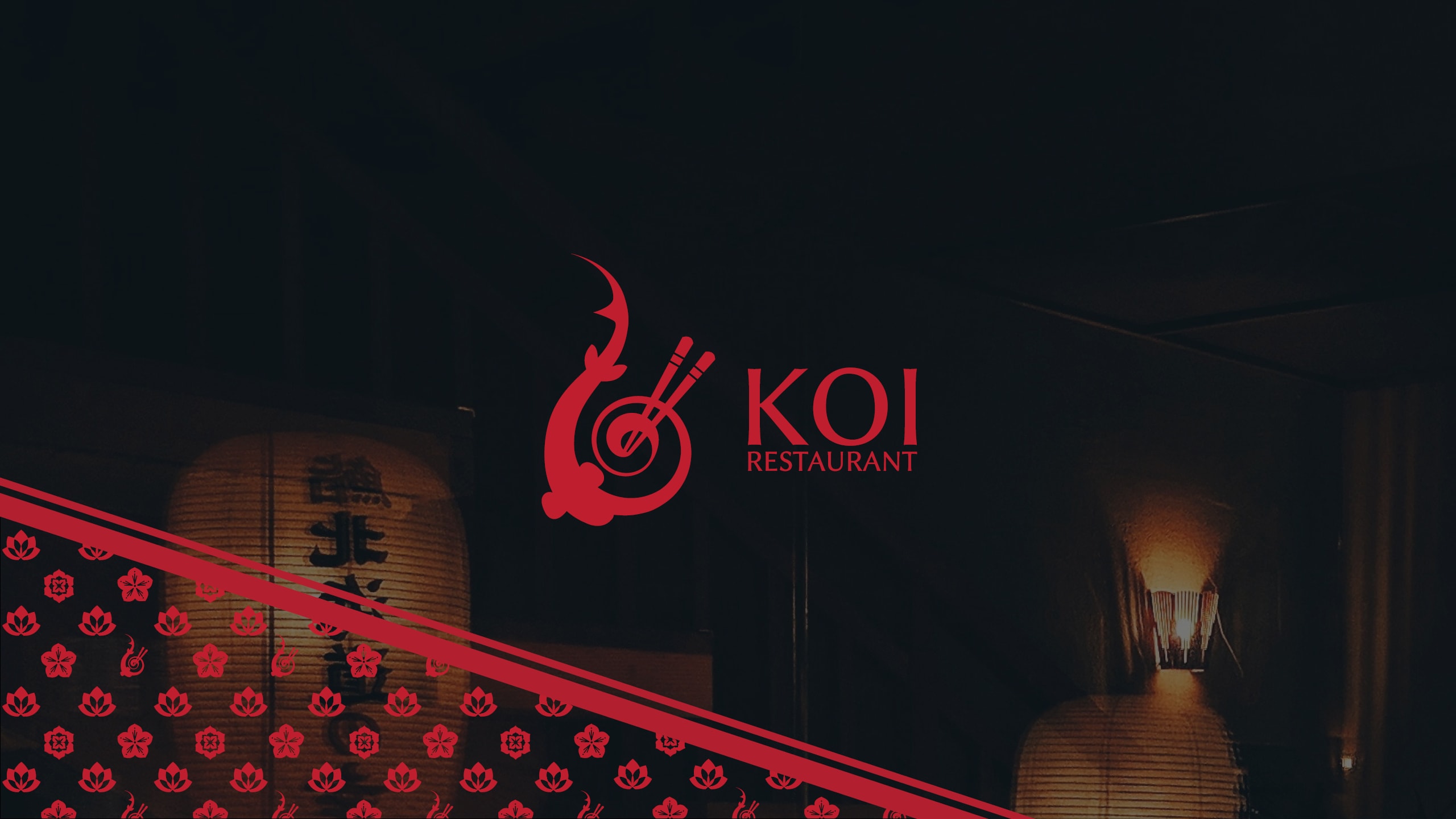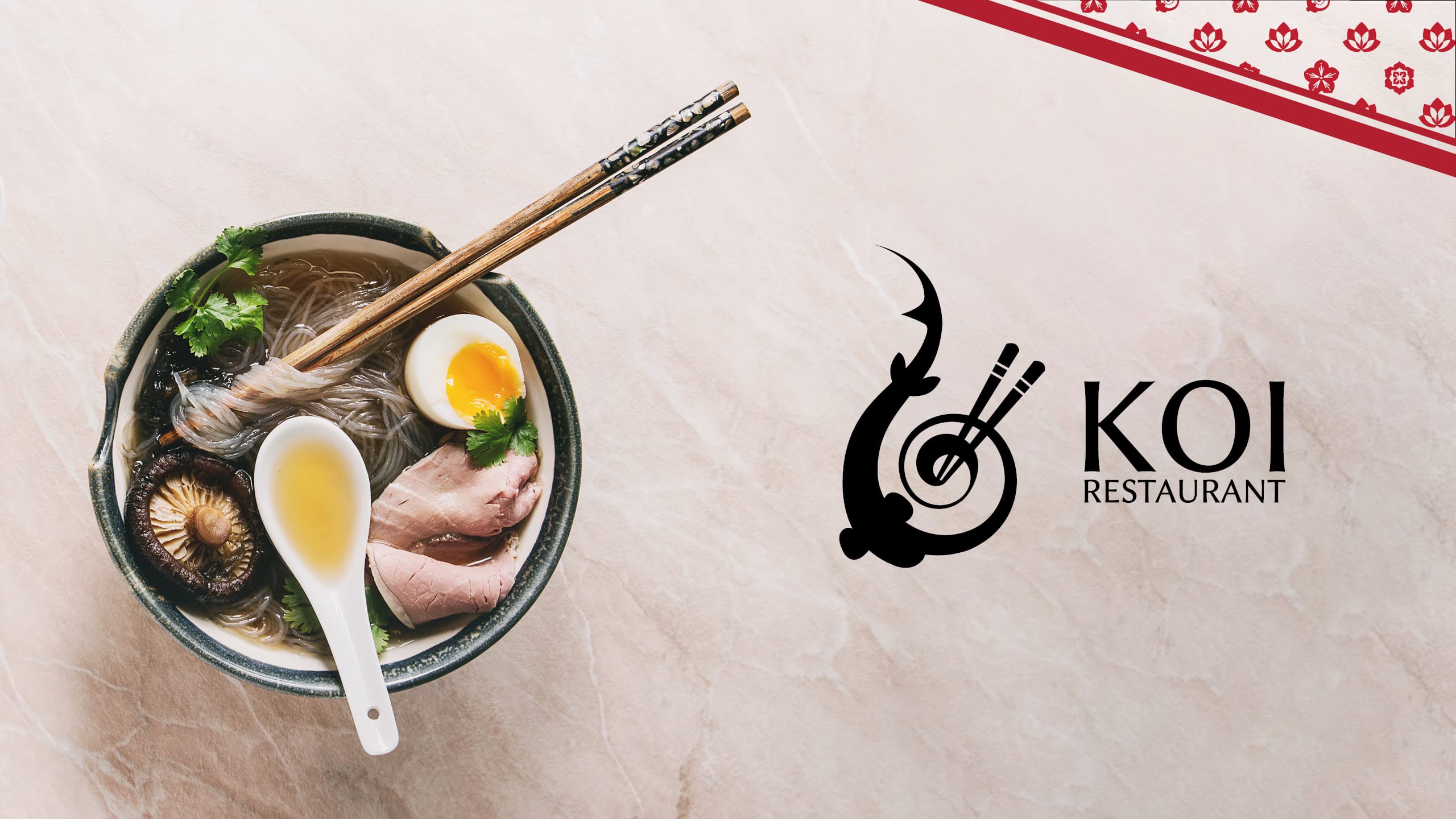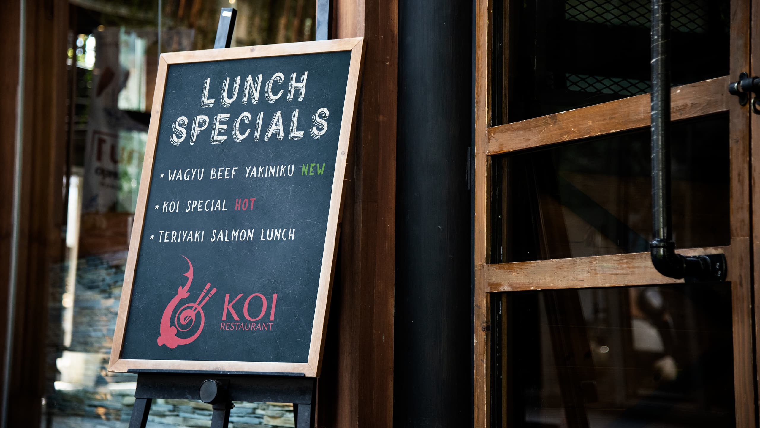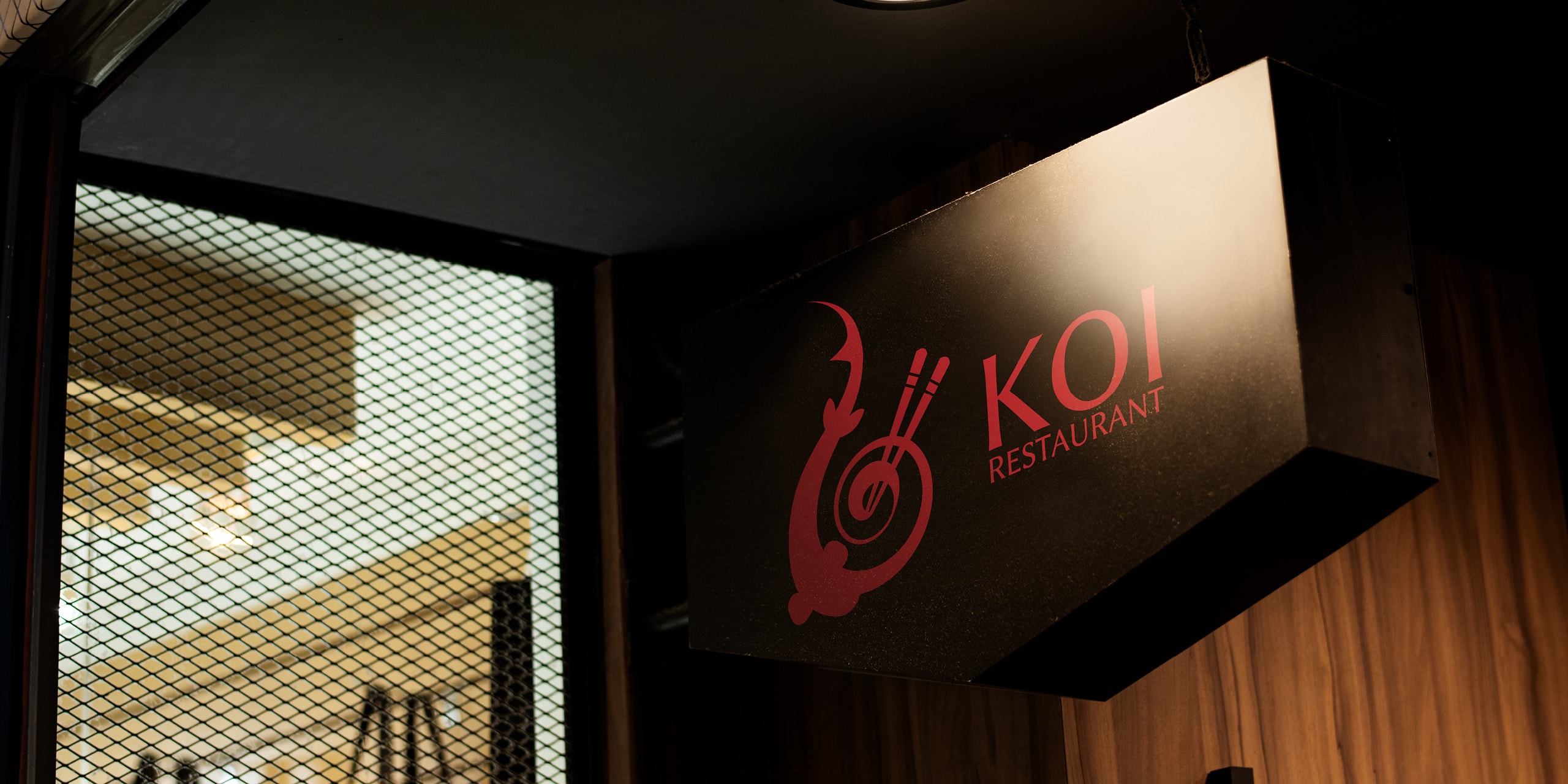
Koi
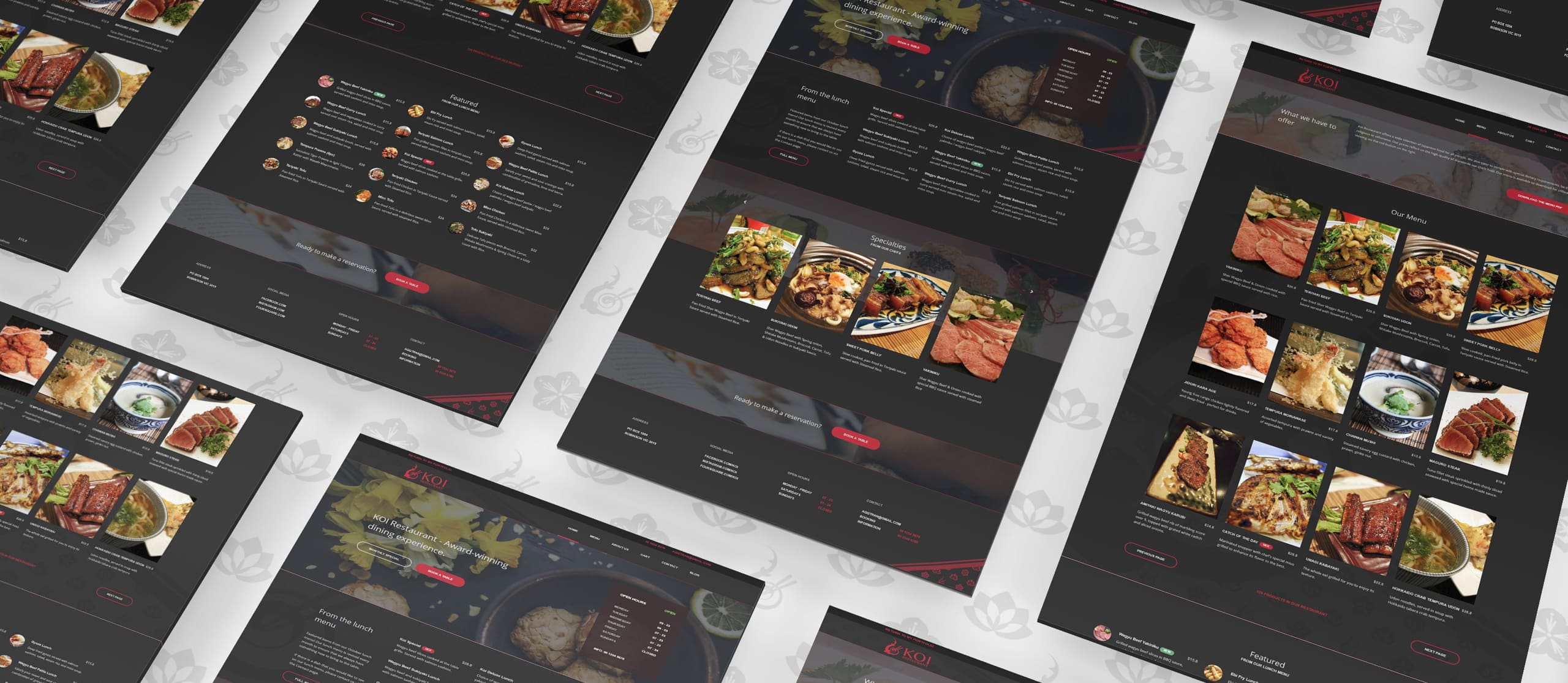
Throughout its 40 year history, Koi has been widely regarded as one of Melbourne’s top premium Japanese restaurants. Koi recognised that its current/outgoing brand and website had become lost in a sea of competing restaurants.
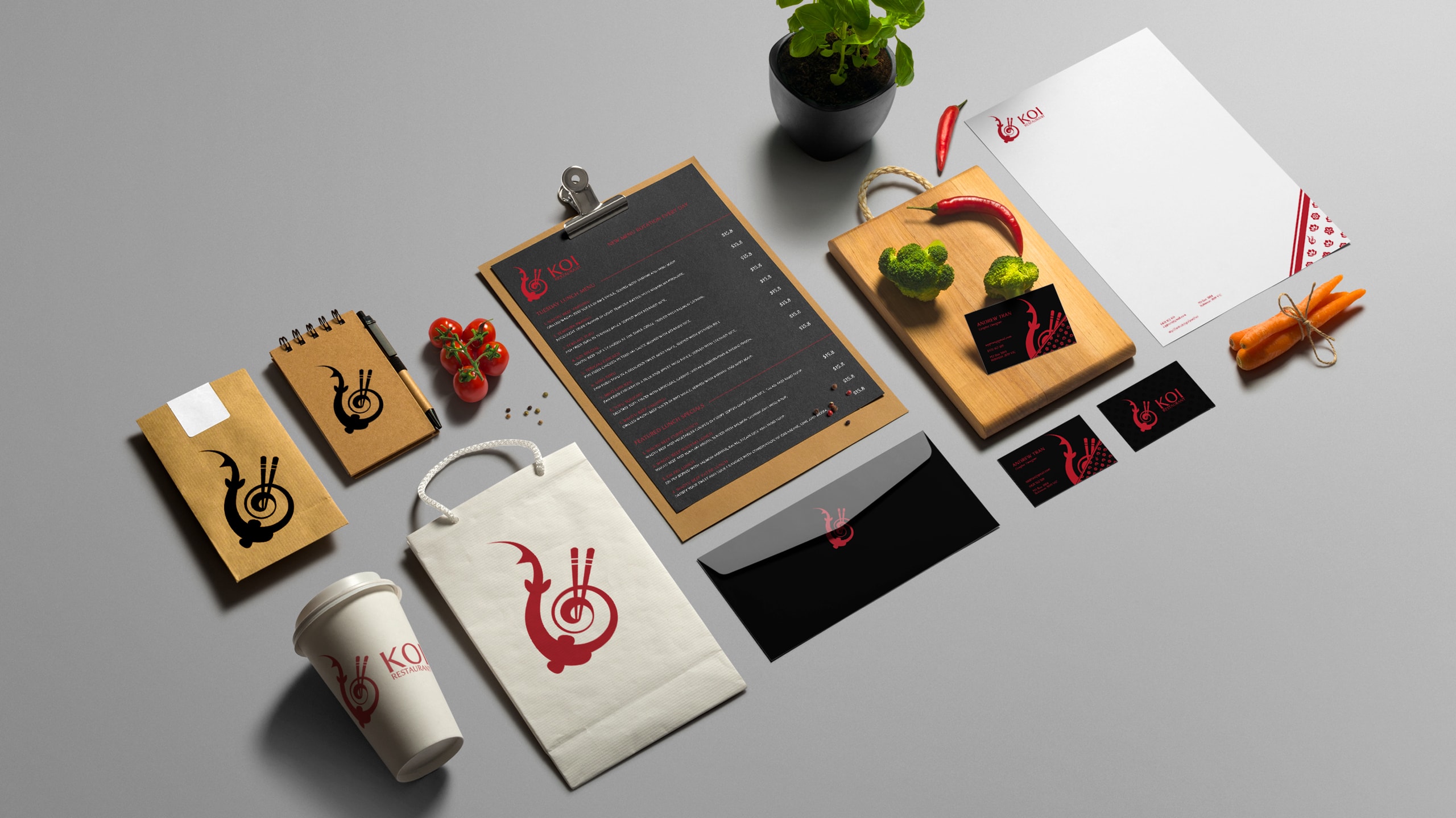
A unique and eye-catching revamp to its style and online presence to reinvigorate its heritage and shine.
The Koi identity is reminiscent of Japanese culture and cuisine, juxtaposing traditional values and premium dining experiences.